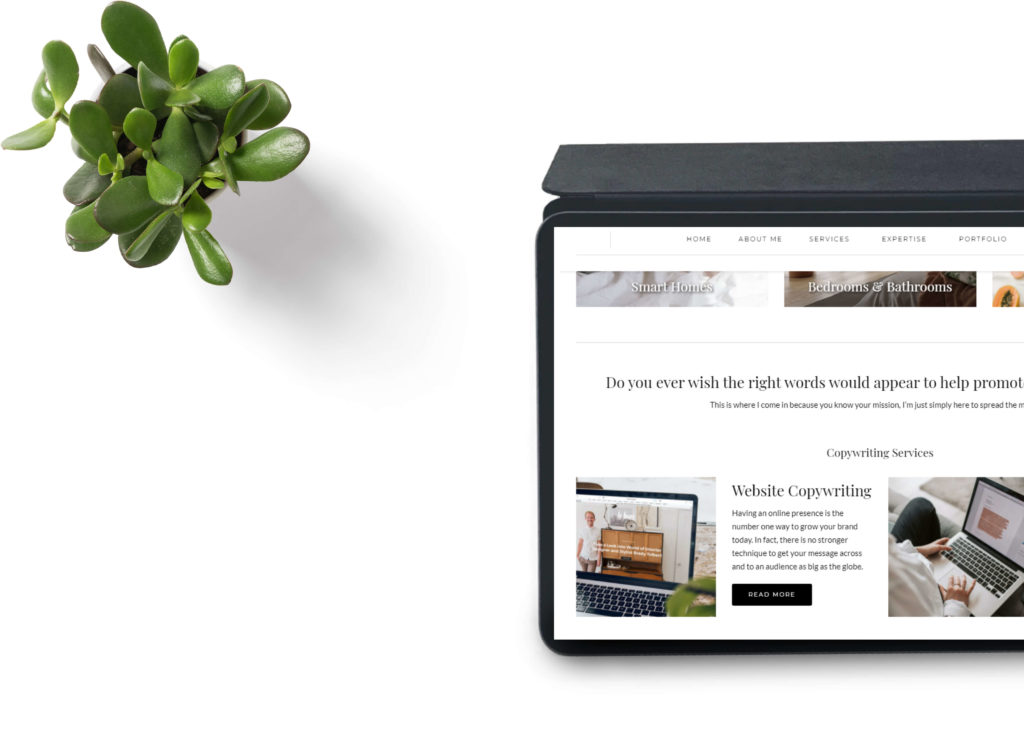
When it comes to website design, less is more for a wonderfully uncluttered result. White space works to keeps pages clean and easy to read by creating breathing room for the reader. While it may be tempting to fill every square inch with text or photos, this can be off-putting to some. Instead, ask your developer to use lots of white space to achieve the right balance, here are five benefits of keeping things simple.
White space builds trust through appealing design
Adopted by luxury brands like Chanel, Kelly Hoppen and Bentley, the paired back approach works well. The concept conveys reliability and trust and can be achieved with good copy, strong imagery and some thought. On the other hand, a messy website will overload readers and can also send out a negative message. The key is to turn down the noise and think about the space in between the vital website design elements.
A good balance between pictures and copy
Professionally designed sites are well-thought-out and signed off before going live. Every aspect is planned to suit the business and brand and lots of white space is used for that luxurious touch. When a website is not well done, it lacks cohesion and structure and usually too much is going on. Like reading a glossy magazine, your website is no different, and harmony between space, text, and imagery is key.
White space makes content easier to read
White space creates a clean backdrop for copy and removes distractions, so content is delivered in a more digestible format. In fact, one study found margins can help with understanding as well as breaking up copy into bite-sized chunks. Ever thought why books are black and white? This is because publishers know plain space helps the mind to concentrate and focus. Treat your website the same and invest in a design, that delivers great copy and more.
More effective call to actions
If your website is cluttered, this can muddle your readers who may miss vital call-to-actions. Call-to-actions play an important role, and they must stand out on your site, or you’ll struggle to convert readers to leads.
Which means increased conversion from the clients you want!
Websites jam-packed with information are not pleasant to read, which is why the overall look is so important. As white space also reduces the chance of distraction, you’ll find your readers can give more attention to your call-to-actions. This means more potential enquiries, and from the clients you want because you’re giving them a better user experience.
What more could you want from your business website? Please get in touch if you would like help with the copy! Thanks for reading – H.

Website Copywriting | The Beauty of Simple White Space

